We developed the brand strategy, name, slogan, and visual identity for Terren, a geodetic office with extensive experience across awide range of projects - from condominium subdivision of family homes to the creation of complex geodetic reports. At the heart of the new brand story is a thorough approach and the ability of their engineers to navigate even the most demanding terrains.
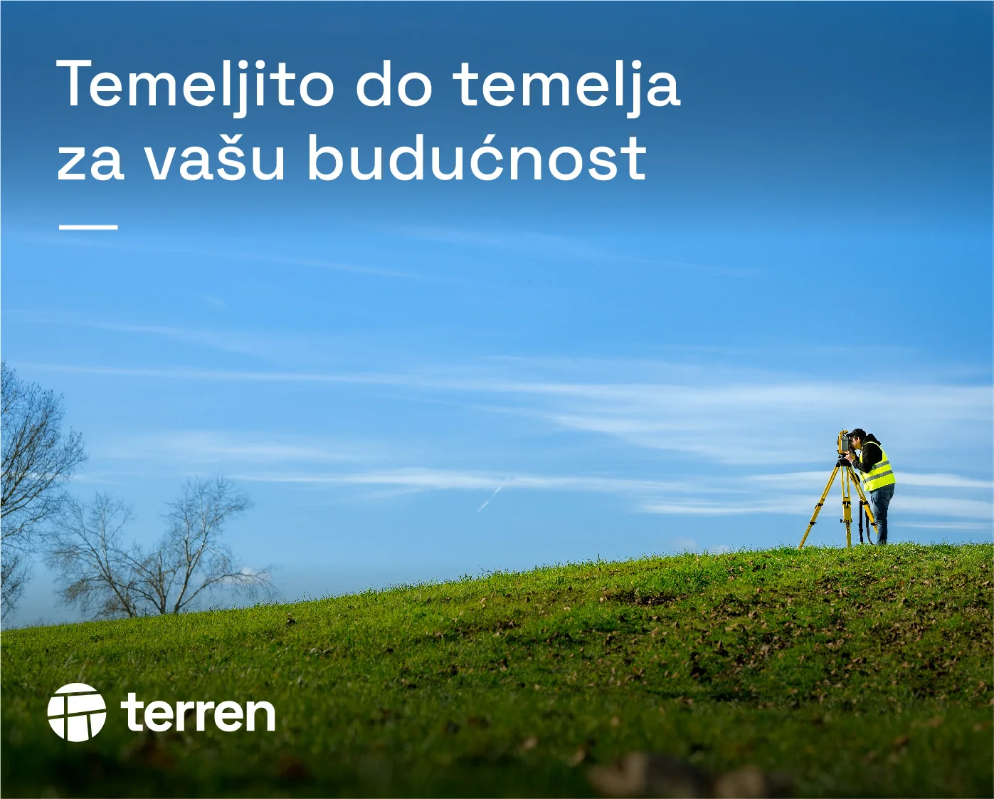
We measure thoroughly and precisely, with experience, expertise, and always on schedule, because we feel at home on any terrain. Whether you’re building a family home, navigating property division, or consolidating land plots, we are the first and last to step on site. We measure with care because in our profession, precision is a responsibility. Our team consists of geodetic engineers with a broad range of knowledge and valuable experience. We employ responsible professionals with both skill and expertise because our work forms the foundation of your home, your business, your holiday house, whether in an urban or rural setting. In our line of work, there is no room for error. That is why we work with focus, dedication, and precision to lay the groundwork for your future.
We navigate some of the most demanding terrains across Croatia every day, yet we also get to enjoy the beauty and diversity of our country, and that’s one of the reasons we love what we do. Croatia is not just about the big cities; it’s also about places like Jelenje and Brinje. Fieldwork often brings its own set of challenges. Being a geodetic expert means having knowledge that spans multiple disciplines - from architecture and construction to even aspects of law. But we enjoy what we do because we know our work helps solve important problems. When measurements are in our hands, projects stay under control.
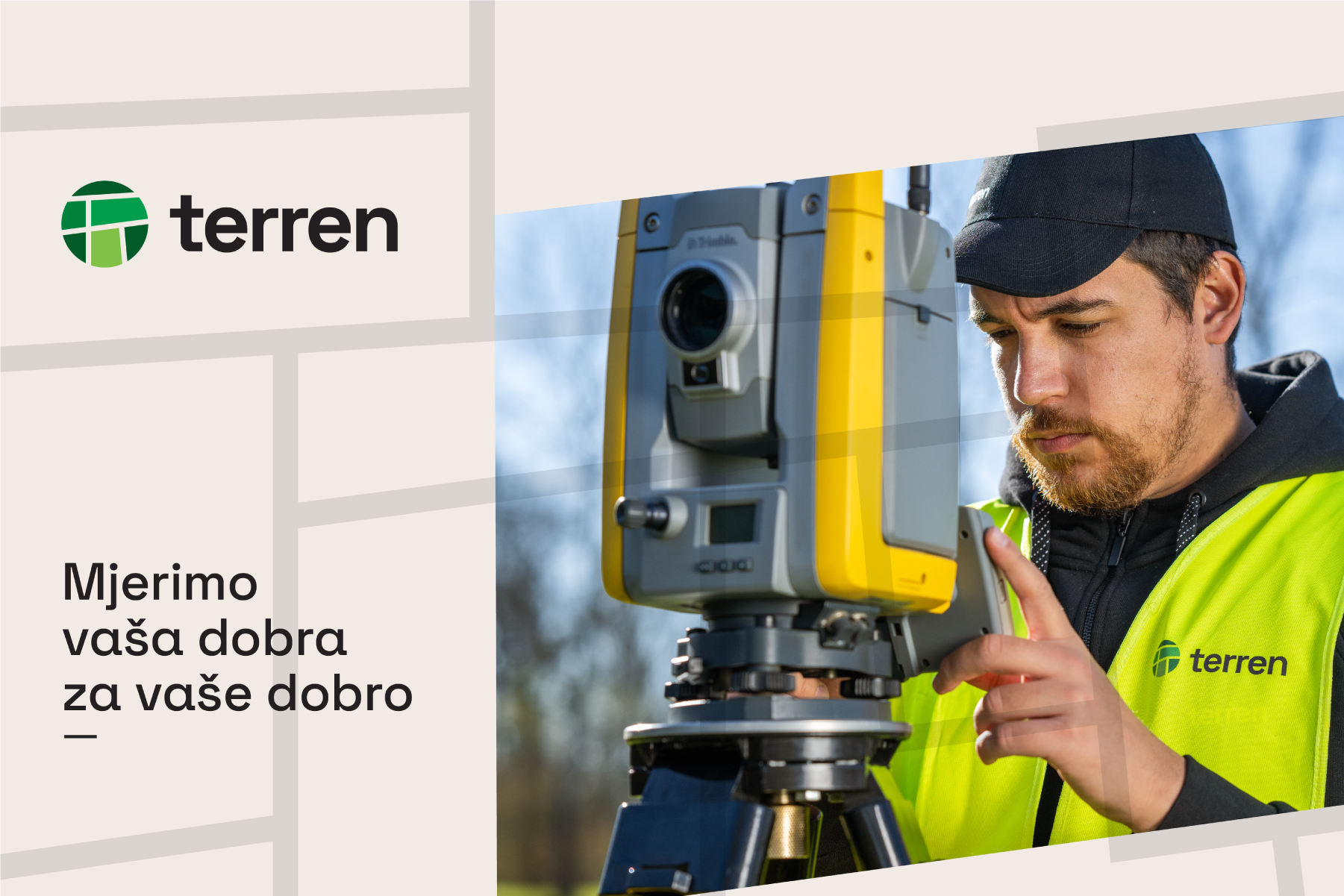
Precision at the core. Built for your future. We measure with purpose, always in your best interest.
When it comes to your land, Terren is on home ground. The name Terren is a blend of the Croatian word teren (terrain) and the Latin word terra (earth/land). It evokes a sense of expertise while emphasising that their skilled team feels at home, even on the most demanding sites. Their work is thorough and precise, helping clients resolve important challenges efficiently and lay solid foundations for the future - a message captured in the brand slogan: Thorough to the core, for your future.
Key Messages
We measure what you value, for your value
We feel at home on any terrain
At home, even on your terrain
Our precision is our promise
Measured right, built to last
Geodesy is the science of precise research
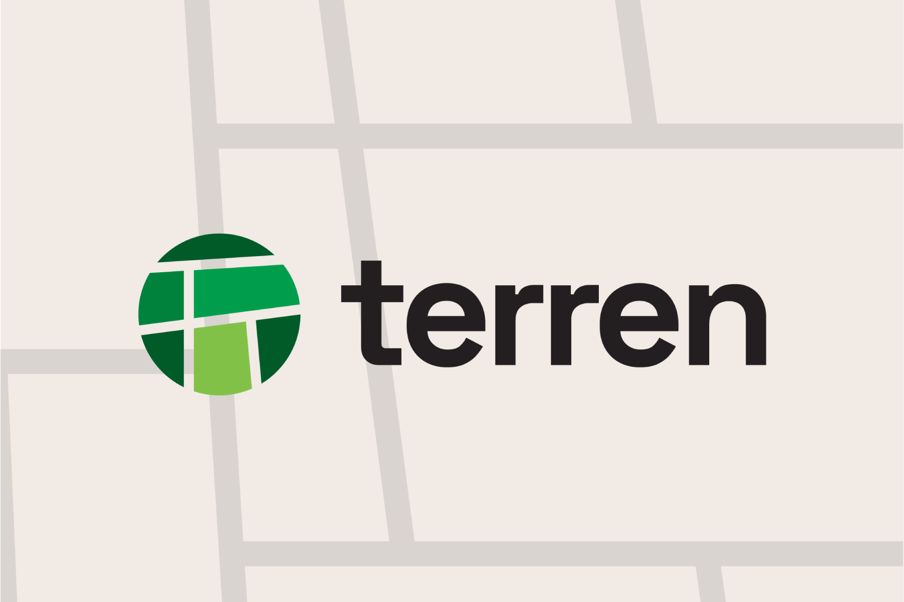
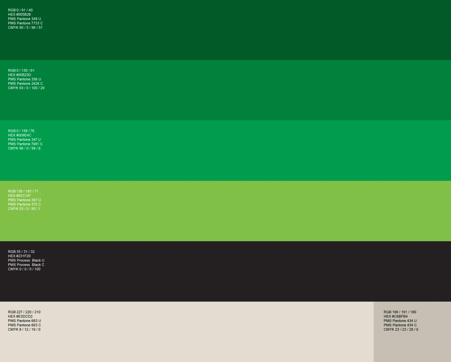
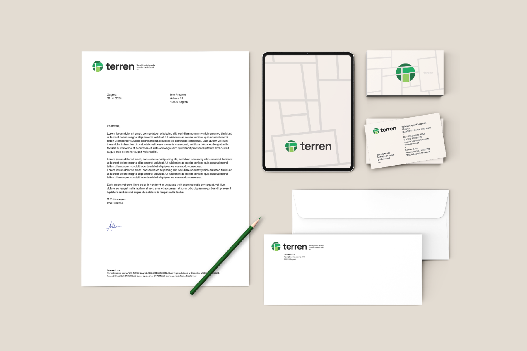
The visual identity is inspired by Terren’s team, who navigate and measure some of the most demanding terrains across Croatia. The logo combines elements of terrain seen from a bird’s-eye perspective, with boundary lines forming the shape of the letter T. Subtle references to geodetic documentation highlight the surveying profession and their involvement in both small- and large- scale projects. These elements are enclosed within a circle, symbolising Terren’s comprehensive approach and focused mindset. The visual language features a modern yet timeless sans-serif typeface - IBM Plex Mono Medium - chosen for its clarity and excellent performance across both digital and print formats. The colour palette is a refined combination of green tones and black, reinforcing the brand’s professional and grounded character.
Brand Strategy & Creative Director: Anja Bauer
Naming Consultant / Copywriter: Anja Bauer
Senior Brand Consultant: Petra Despot Domljanović
Senior Brand Implementor: Jelena Mezga
Brand Consultant: Maja Đaković
Art Director / Designer: Damir Mazinjanin
Designer: Martina Marinić Kadić

