We created a brand strategy, slogan, employer branding strategy and visual identity for Corelion, a fast-growing IT company working hand-in-handwith US-based Creative Tech, to bring their core promise to life: seamless, trustworthy, creative and caring IT support for the healthcare industry.
Our goal was for the new name to reflect not only their technical expertise, but also the heart behind their work – their unwavering commitment to care. Hence, Corelion, a name that embodies our essence – the heart that lies in our core. With a focus on healthcare, every action they take, from small fixes to large-scale migrations, is done with care and intention. This is what sets them apart and what became the foundation of our brand narrative.
From the beginning, it was clear that Corelion’s and Creative Tech’s story wasn’t just about infrastructure or cloud environments – it was about people. As a Managed Services Provider (MSP) with over 120 employees in Croatia, one thing stood out to us – that their team stands at the intersection of tech and humanity. Their unique strength lies in relevant expertise and a deeply human approach.
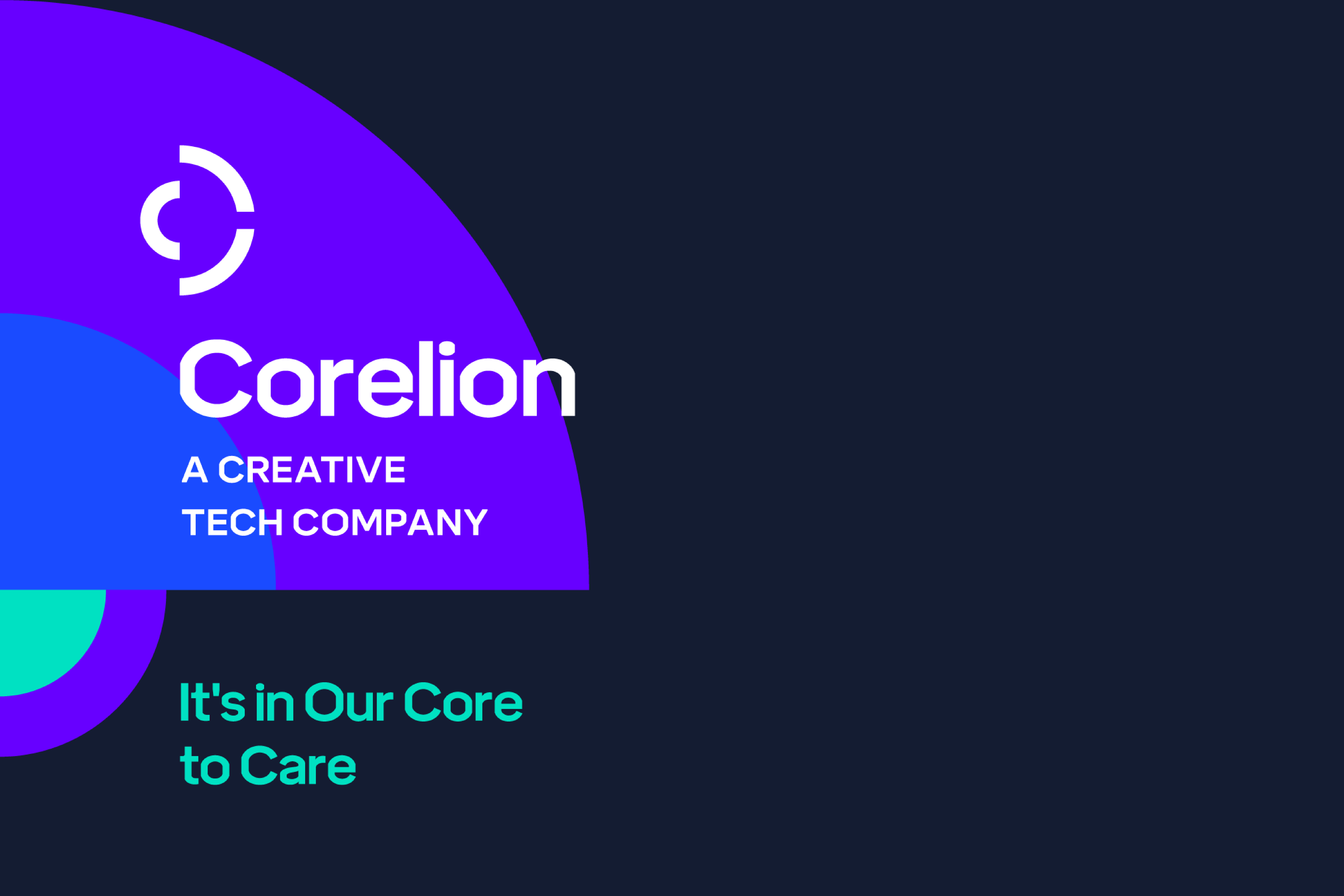
The employer branding stems from thorough discussion on internal strengths, desired positioning among current and potential employees, core values and challenges related to internal processes. It shines a light on Corelion’s internal values – a caring environment, opportunity for growth and passion to make an impact. Going forward, the seamless integration of the brand strategy, internal perception and owner’s vision led us to the internal positioning – The Difference Starts With You, and the internal manifesto.
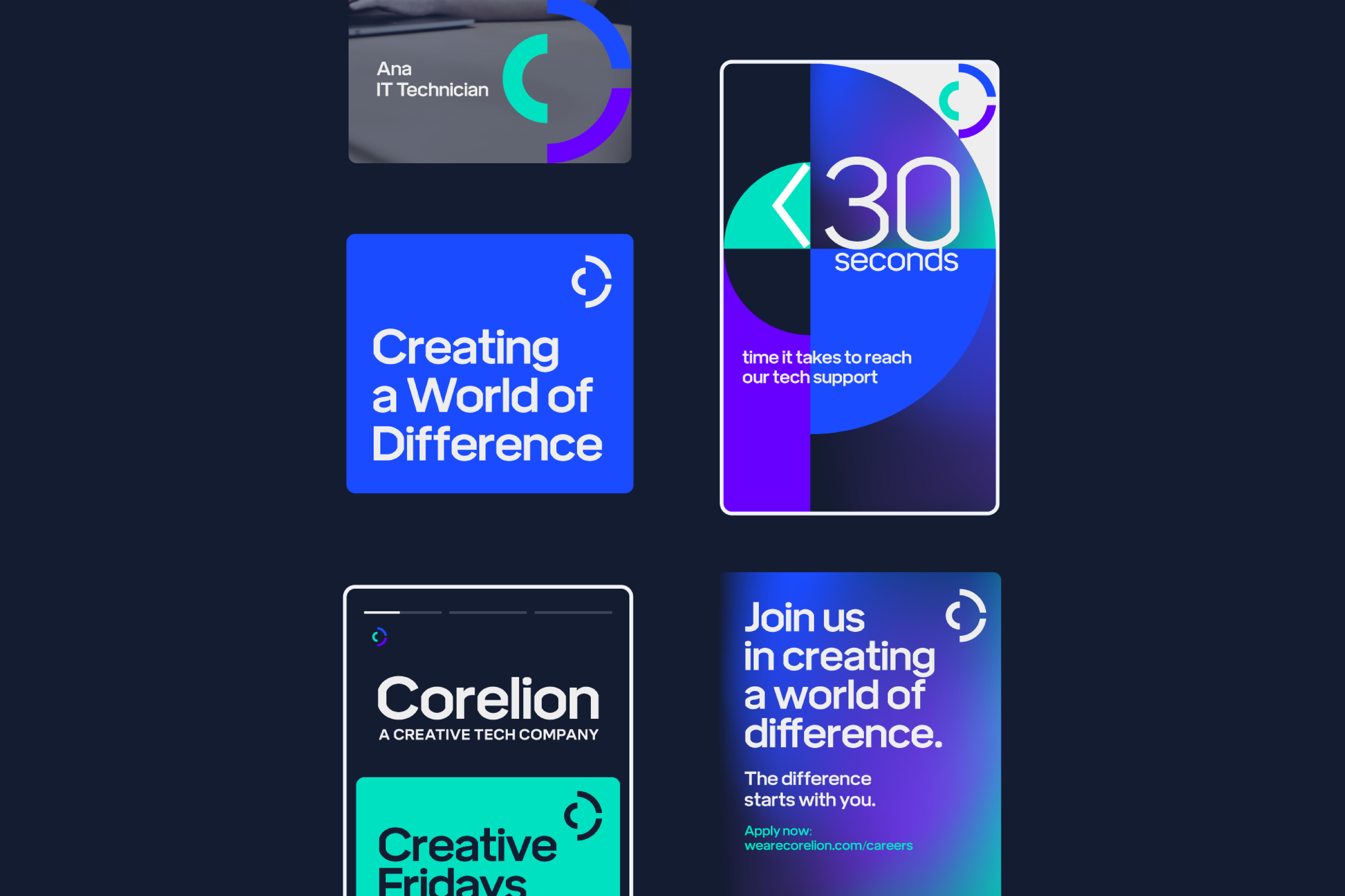
“Life is a series of steps. Steps are sometimes daunting. But steps can be inviting with the right frame of mind. We nurture the right climate in our company. Our motto is to nourish your growth so we can grow together. Learn new things, share knowledge, hang out with kind people. Together we grow. Your growth is our growth. Because of this we are creating a better, stronger world, a world of difference. The difference starts with you. Create a world of difference.”
In addition to the slogans It’s in Our Core to Care and We Care to the Core, numerous messages articulate the essential promise at the heart of the brand, positioning Corelion as a distinct voice in the IT healthcare space:
Why healthcare? Because we care.
The smallest detail matters in IT healthcare.
Our strength is relevant knowledge and expertise.
Relevant knowledge, better IT support.
More years of experience, better response time.
Trustworthy and dependable IT support.
Together, these messages offer a toolkit that speaks to both emotional and practical values: confidence, competence, and compassion.
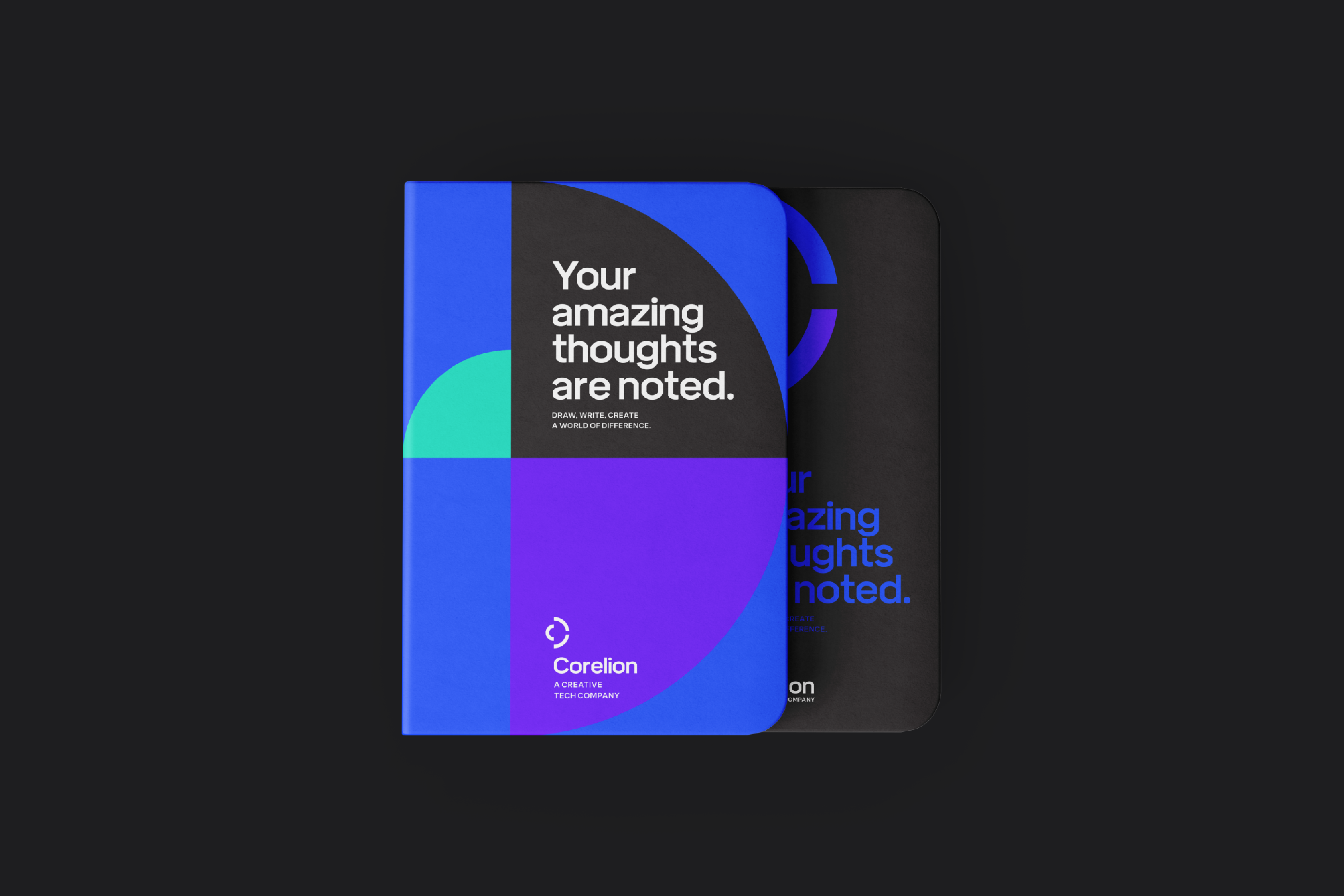
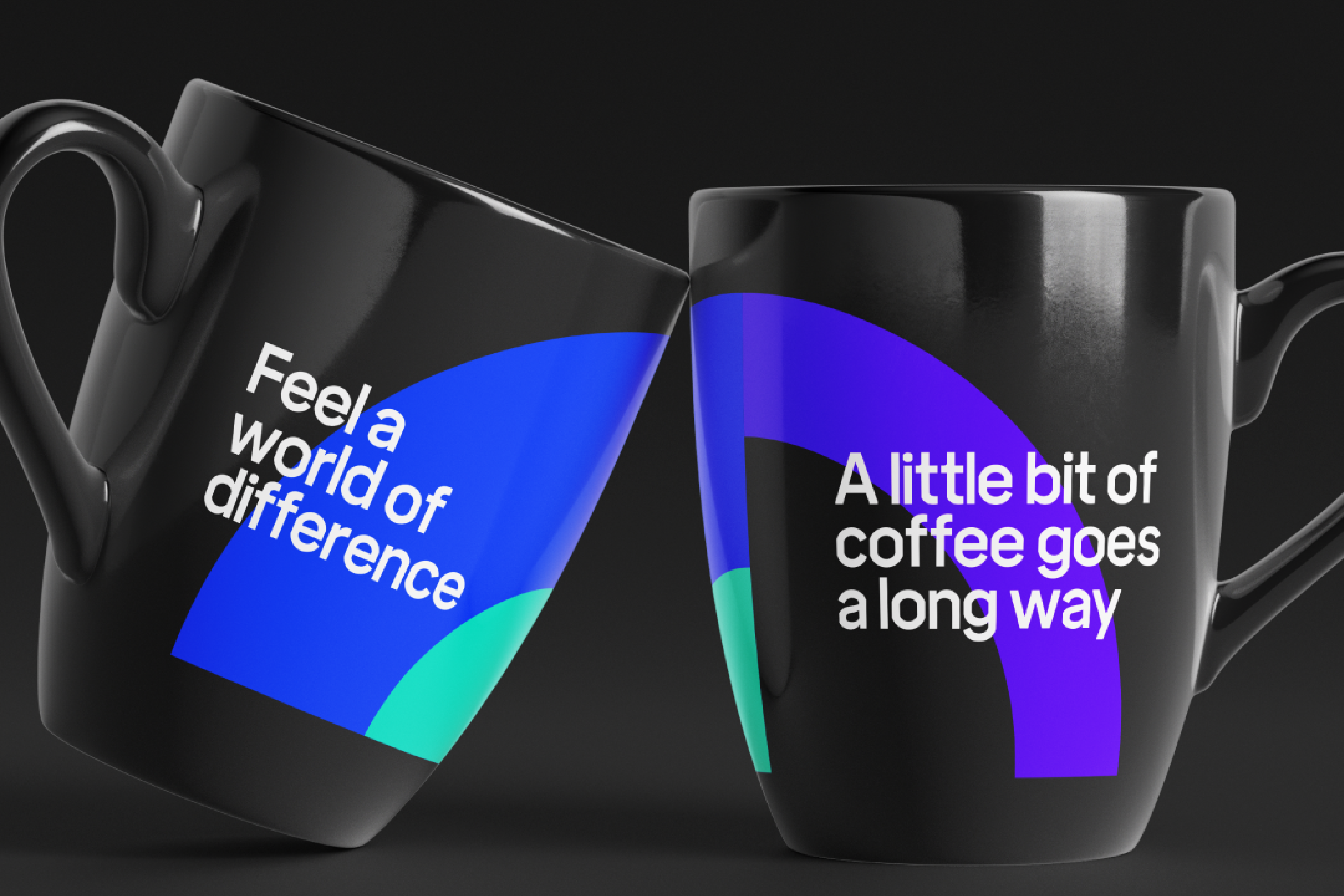
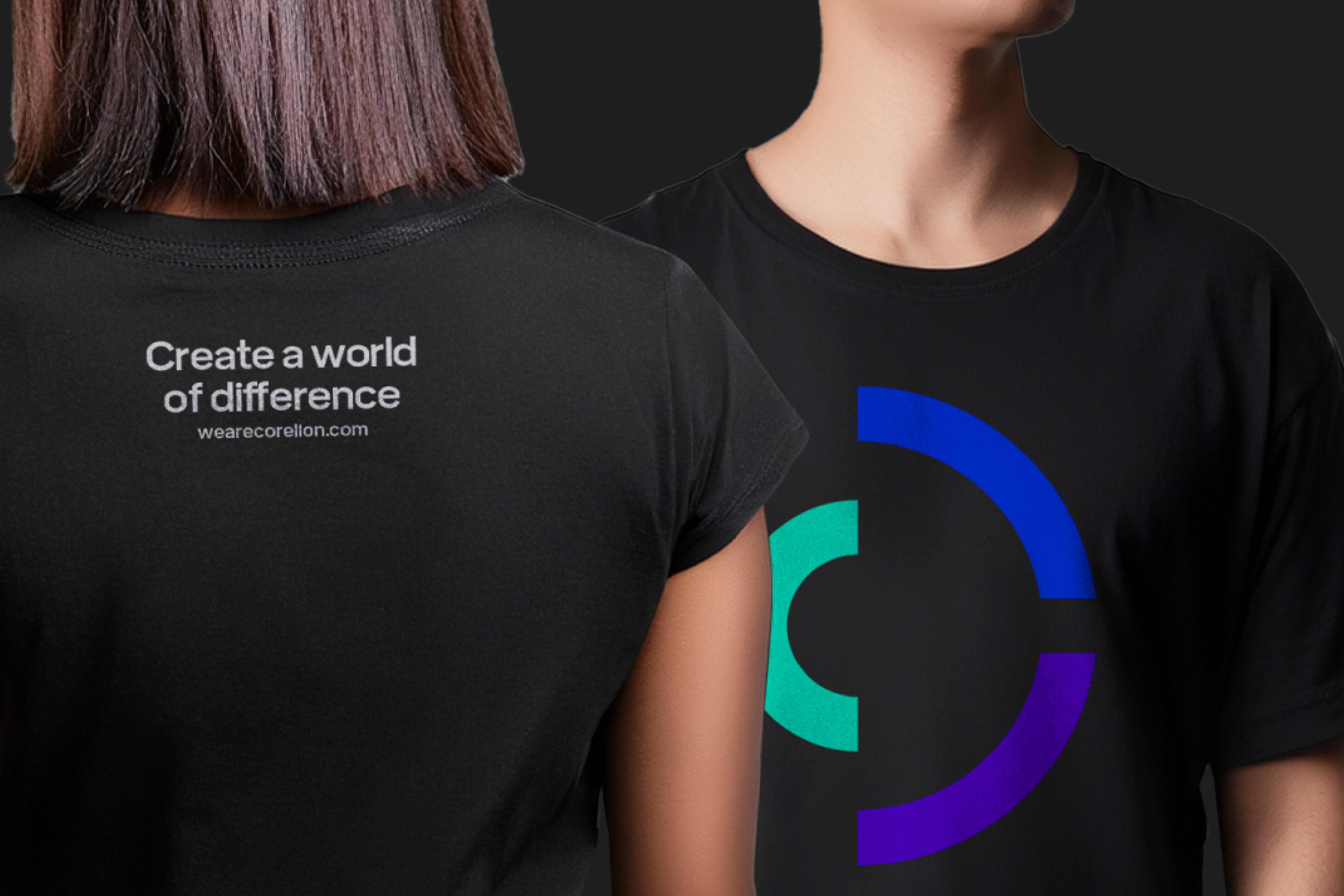
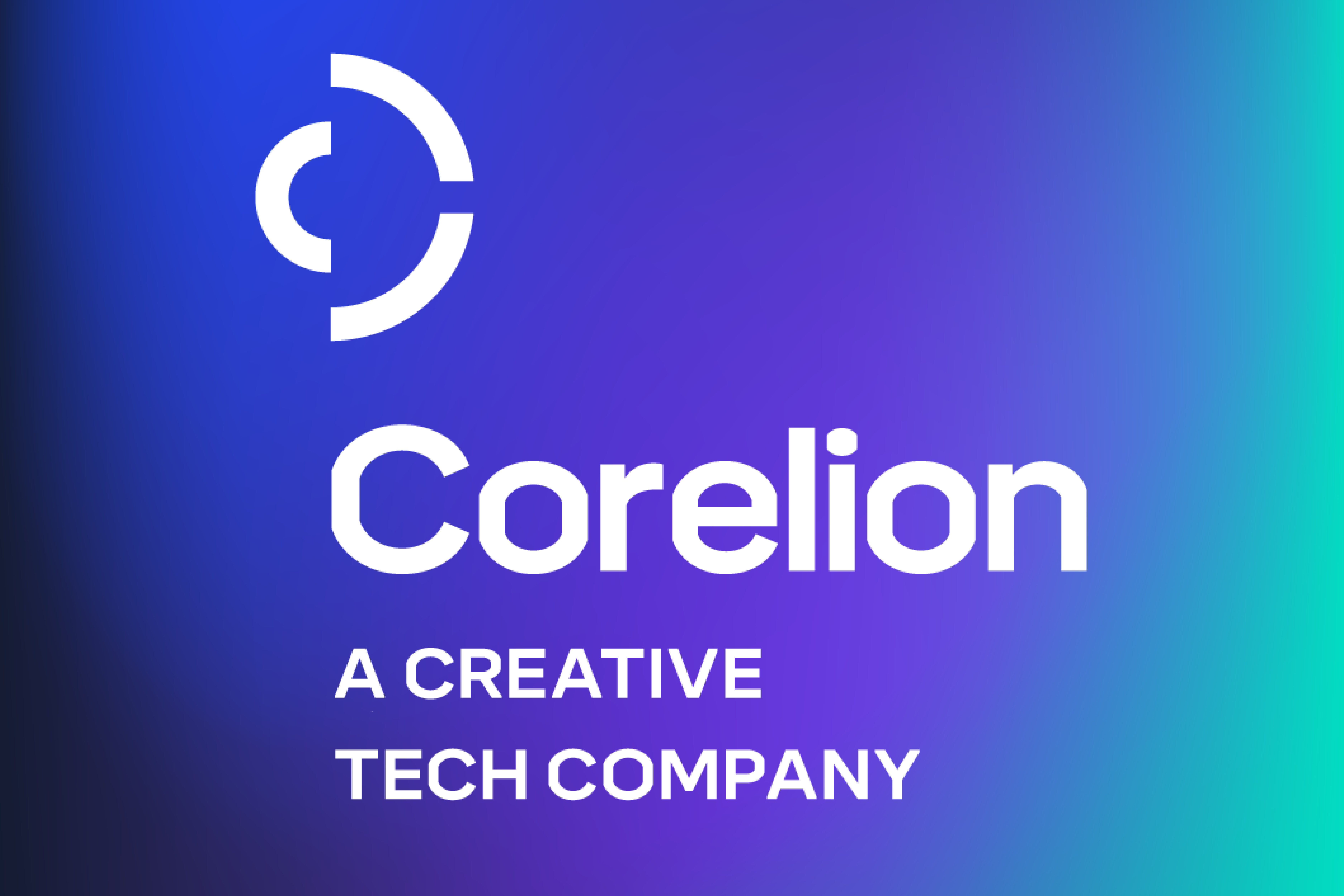
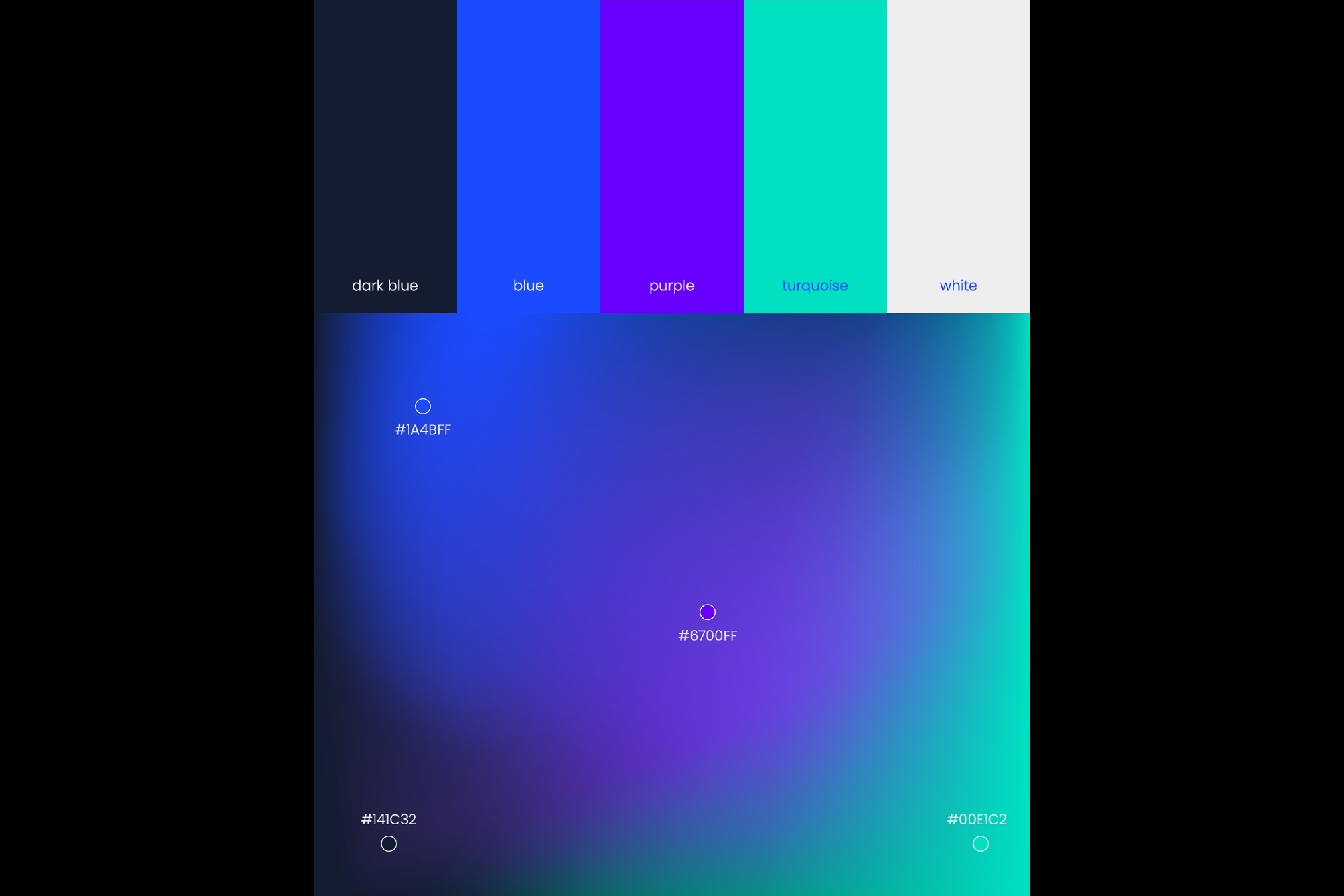
Our logotype is a combination of circular shapes that are associated with the letter C and “core”– symbolizing that Corelion cares to the core. Due to its dynamic look, the sign also looks like a circle and the globe, communicating their extensive yet in-depth approach. The color palette consists of blue, black, purple and mint colors communicating technological excellence, determination and a fresh approach.
Brand Strategy & Creative Director: Anja Bauer
Naming Consultant: Anja Bauer
Copywriter: Anja Bauer, Petra Crnički
Senior Brand Consultant: Petra Despot Domljanović
Senior Brand Implementor: Jelena Mezga
Brand Consultant: Maja Đaković
Art Director / Designer: Tanja Pružek Šimpović
Motion Graphics: Andrej Todorovski